Note
Go to the end to download the full example code. or to run this example in your browser via Binder
b. scatter
This file shows the usage of scatter() function.
scatter function is very similar to plot() function, however
it provides some functionalities which are not available for plot function.
# sphinx_gallery_thumbnail_number = 4

import numpy as np
import pandas as pd
import matplotlib.pyplot as plt

from easy_mpl.utils import add_cbar
from matplotlib.lines import Line2D
from easy_mpl.utils import version_info
from easy_mpl.utils import map_array_to_cmap

from easy_mpl import scatter

f = "https://raw.githubusercontent.com/AtrCheema/AI4Water/master/ai4water/datasets/arg_busan.csv"
dataframe = pd.read_csv(f, index_col='index')
dataframe = dataframe[['tide_cm', 'pcp_mm', 'sal_psu', 'pcp12_mm',
                       'sul1_coppml', 'tetx_coppml', 'blaTEM_coppml', 'aac_coppml']]

version_info()  # print version information of all the packages being used
{'easy_mpl': '0.21.5', 'matplotlib': '3.9.4', 'numpy': '2.0.2', 'pandas': '2.2.3', 'scipy': '1.13.1'}

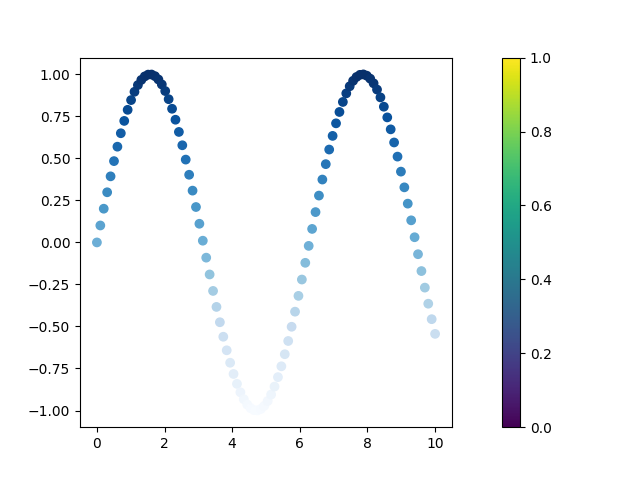
Instead of drawing all the markers in same color, we can
make the color to show something useful. Below, the color
represents y values.
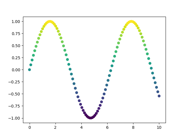
As the value of y goes higher, the color of marker becomes yellowish.
On the other hand, as the value of y goes lower, the color becomes bluish.
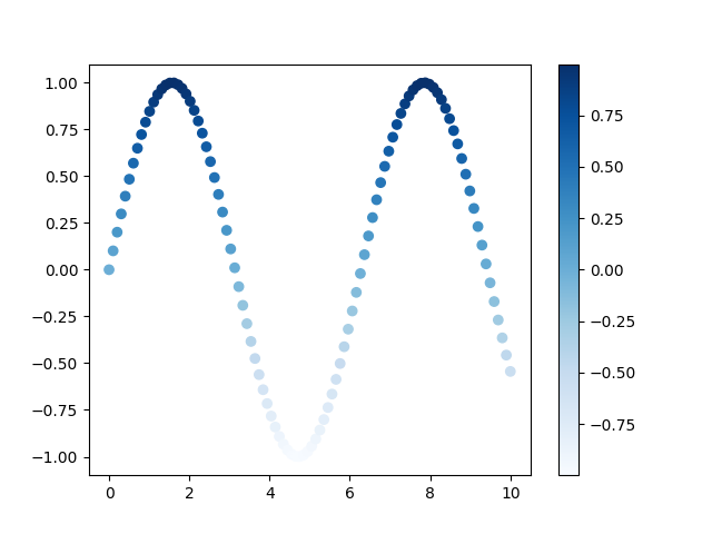
Instead of making the color to show values of y, can use another array for the color.
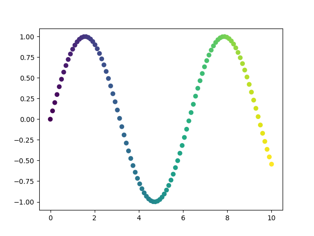
Now the color of marker changes from left to right instead of from bottom to top.
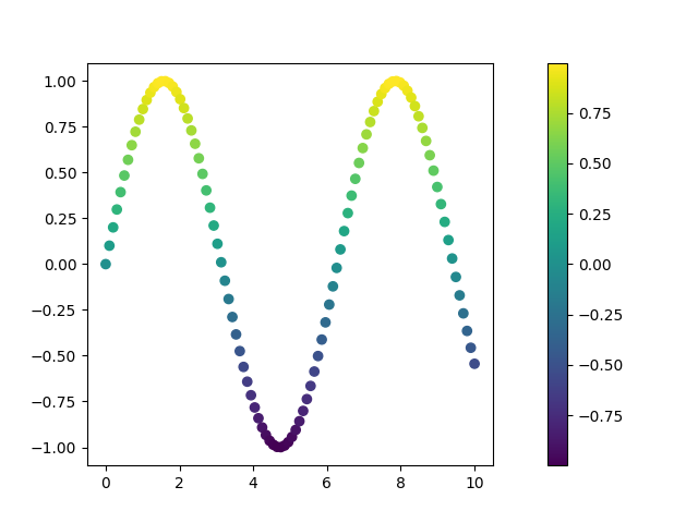
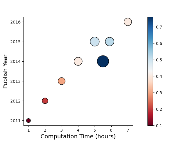
We can show the colorbar by setting the colorbar to True.
The function scatter returns a tuple. The first argument is a matplotlib
axes which can be used for further processing
We can provide the actual values of rbg as list/array to color/c argument.
However, if we show the colorbar, the colorbar in such a case will be wrong.
The properties of the markers can be manipulated.

We can use any color map to show the marker colors. A complete list of valid matplotlib colormaps can be found here
The size of the marker can be tuned using s keyword. If a single value is provided,
all markers will be of single size. We can however make each maker of variable size
by passing an array to s keyword.
time = [1, 2, 3, 4, 5, 7, 5.9, 5.5]
parameters = [100, 200, 300, 400, 500, 350, 450, 800]
performance = [0.1, 0.2, 0.3, 0.4, 0.5, 0.4, 0.52, 0.76]
year = [2011, 2012, 2013, 2014, 2015, 2016, 2015, 2014]

_ = scatter(time, year, c=performance, s=parameters,
        colorbar=True,
        edgecolors='black', linewidth=1.0,
        cmap="RdBu",
        ax_kws={"xlabel":"Computation Time (hours)", 'ylabel': "Publish Year",
                'xlabel_kws': {"fontsize": 14},'ylabel_kws': {"fontsize": 14},
                'top_spine': False, 'right_spine': False})
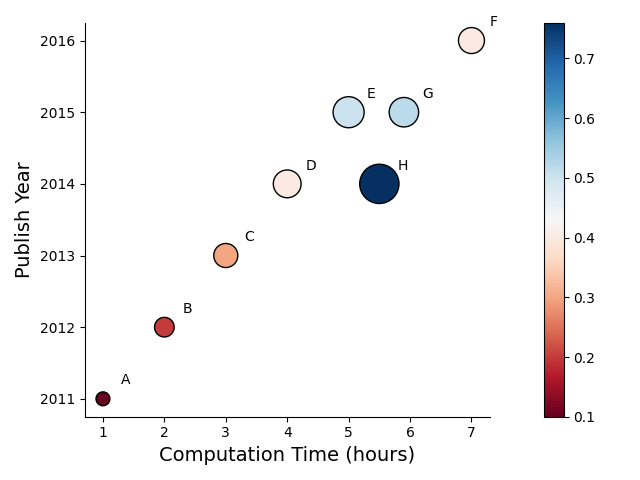
We can also annotate the markers by providing marker_labels argument.
time = [1, 2, 3, 4, 5, 7, 5.9, 5.5]
parameters = [100, 200, 300, 400, 500, 350, 450, 800]
performance = [0.1, 0.2, 0.3, 0.4, 0.5, 0.4, 0.52, 0.76]
year = [2011, 2012, 2013, 2014, 2015, 2016, 2015, 2014],
names = ["A", "B", "C", "D", "E", "F", "G", "H"]

_ = scatter(time, year, c=performance, s=parameters,
        colorbar=True,
        edgecolors='black', linewidth=1.0,
        cmap="RdBu",
        marker_labels=names,
        yoffset=0.2,
        xoffset=0.3,
        ax_kws={"xlabel":"Computation Time (hours)", 'ylabel': "Publish Year",
                'xlabel_kws': {"fontsize": 14},'ylabel_kws': {"fontsize": 14},
                'top_spine': False, 'right_spine': False, 'tight_layout': True})
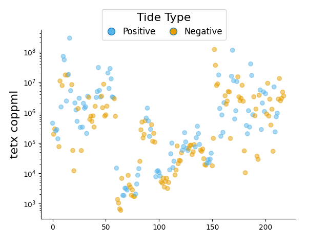
unique colors for group of values
df = dataframe.dropna().reset_index(drop=True)
tide = df['tide_cm']
tetx = df['tetx_coppml']
colors = np.full(len(tide), fill_value="#E69F00")
colors[np.argwhere(tide.values<0.0)] =  "#56B4E9"
ax, pc = scatter(np.arange(len(tide)), tetx,
        ax_kws=dict(logy=True, ylabel="tetx coppml", ylabel_kws={"fontsize": 16},
                    top_spine=False, right_spine=False),
        color=colors, alpha=0.5, zorder=10)
fig = ax.get_figure()
# Create handles for lines.
handles = [
    Line2D(
        [], [], label=label,
        lw=0, # there's no line added, just the marker
        marker="o", # circle marker
        markersize=10,
        markerfacecolor=colors[idx], # marker fill color
    )
    for idx, label in enumerate(['Positive', 'Negative'])
]

# Add legend -----------------------------------------------------
legend = fig.legend(
    handles=handles,
    bbox_to_anchor=[0.5, 0.9], # Located in the top-mid of the figure.
    fontsize=12,
    handletextpad=0.6, # Space between text and marker/line
    handlelength=1.4,
    columnspacing=1.4,
    loc="center",
    ncol=6,
title_fontsize=16,
        title="Tide Type"
)
fig.show()
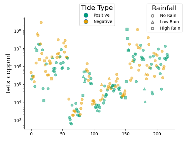
marker style for group of values
colors = "#009E73", "#E69F00"
def make_color(array):
    clrs = np.full(len(array), fill_value=colors[0])
    clrs[np.argwhere(array < 0.0)] = colors[1]
    return clrs


markers = ["o", "^", "s"] # circle, triangle, square
labels = ["No Rain", "Low Rain", "High Rain"]
Y = [df.loc[df['pcp_mm']<=0.0],
        df.loc[(df['pcp_mm']>0.0) & (df['pcp_mm']<=1.0)],
        df.loc[df['pcp_mm']>1.0]]

X = [df.loc[df['pcp_mm']<=0.0].index,
        df.loc[(df['pcp_mm']>0.0) & (df['pcp_mm']<=1.0)].index,
        df.loc[df['pcp_mm']>1.0].index]

_ = ax = plt.subplots()
for label, marker, x, y in zip(labels, markers, X, Y):
    color = make_color(y['tide_cm'].values)
    axes, pc = scatter(x=x, y=y['tetx_coppml'], marker=marker,
            ax_kws=dict(logy=True, ylabel="tetx coppml", ylabel_kws={"fontsize": 16},
                                            top_spine=False, right_spine=False),
            color=color, alpha=0.5, zorder=10,
            label=label,
            show=False)

handles = [Line2D([], [], label=label,
                  marker="o", markersize=10, lw=0, markerfacecolor=colors[idx])
    for idx, label in enumerate(['Positive', 'Negative'])
]
fig = axes.get_figure()
legend = fig.legend(handles=handles, bbox_to_anchor=[0.5, 0.9],
title_fontsize=16,title="Tide Type", loc="center")

leg = plt.legend(bbox_to_anchor=[0.8, 0.85], title="Rainfall", title_fontsize=16)
for h in leg.legend_handles:  # for mpl ver<3.8 it is leg.legendHandles
    h.set_facecolor('white')
    h.set_edgecolor('k')
    h.set_linewidth(2.0)
plt.show()
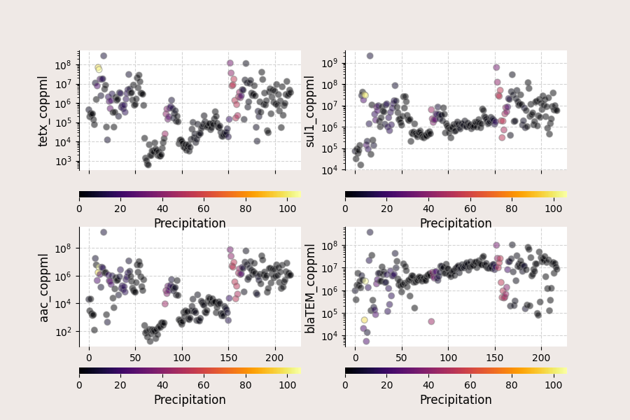
df = dataframe.dropna().reset_index(drop=True)

def draw_scatter(target, ax):
    #``visible`` argument for ``ax.grid`` not available in
    # matplotlib version 3.3
    ax.grid(visible=True, ls='--', color='lightgrey')
    c, mapper = map_array_to_cmap(df['pcp12_mm'].values, "inferno")
    ax_, _ = scatter(np.arange(len(df)), df[target],
                      color=c, alpha=0.5, s=40, ec="grey", zorder=10,
                      ax_kws=dict(logy=True, ylabel=target, ylabel_kws={"fontsize": 12},
                                  top_spine=False, right_spine=False, bottom_spine=False),
                      ax=ax, show=False)
    add_cbar(ax_, mappable=mapper, orientation="horizontal", pad=0.3,
                 border=False,
                 title="Precipitation", title_kws=dict(fontsize=12))
    return

f, all_axes = plt.subplots(2,2, sharex="all", facecolor="#EFE9E6", figsize=(9, 6))
targets = ["tetx_coppml", "sul1_coppml", "aac_coppml", "blaTEM_coppml"]
for col, axes in zip(targets, all_axes.flatten()):
    draw_scatter(col, axes)
plt.show()
Total running time of the script: (0 minutes 3.540 seconds)