Note
Go to the end to download the full example code. or to run this example in your browser via Binder
d. bar_chart
This file shows the usage of bar_chart() function.
# sphinx_gallery_thumbnail_number = 4

import numpy as np
from easy_mpl import bar_chart, plot
import matplotlib.pyplot as plt
from easy_mpl.utils import version_info
from easy_mpl.utils import despine_axes

version_info()  # print version information of all the packages being used
{'easy_mpl': '0.21.5', 'matplotlib': '3.9.4', 'numpy': '2.0.2', 'pandas': '2.2.3', 'scipy': '1.13.1'}
A basic chart requires just a list of values to represent as bars.
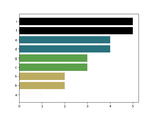
_ = bar_chart([1,2,3,4,4,5,3,2,5])
we can also provide a numpy array instead
setting the labels for axis
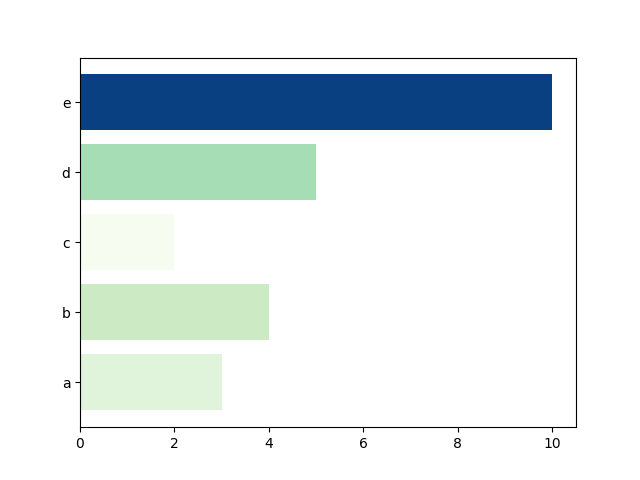
_ = bar_chart([3,4,2,5,10], ['a', 'b', 'c', 'd', 'e'])
sorting the bars according to their values
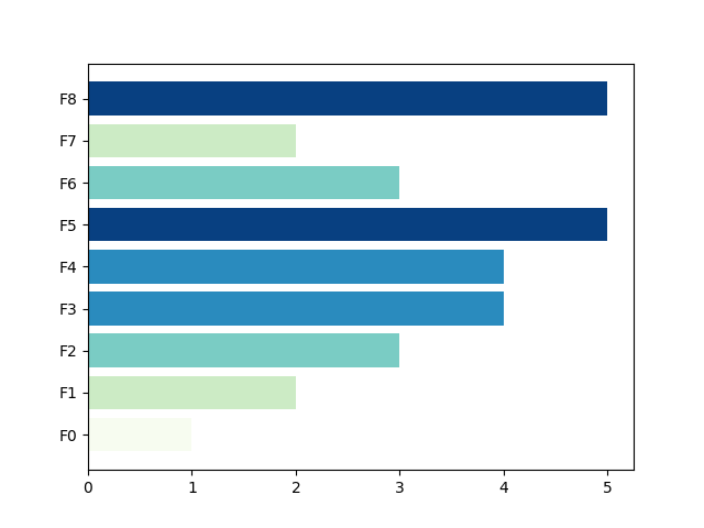
_ = bar_chart([1,2,3,4,4,5,3,2,5],
    ['a','b','c','d','e','f','g','h','i'],
          sort=True)
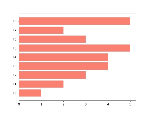
The default color of bars are chosen randomly. We can specify the color in many ways, e.g. a single color for all bars
_ = bar_chart([1,2,3,4,4,5,3,2,5], color="salmon")
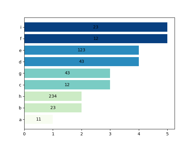
adding bar labels
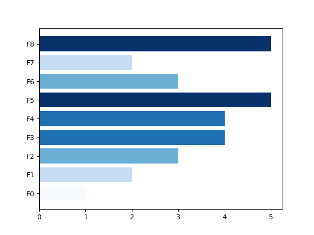
_ = bar_chart(
    [1,2,3,4,4,5,3,2,5],
    ['a','b','c','d','e','f','g','h','i'],
    bar_labels=[11, 23, 12,43, 123, 12, 43, 234, 23],
    cmap="GnBu",
    sort=True)
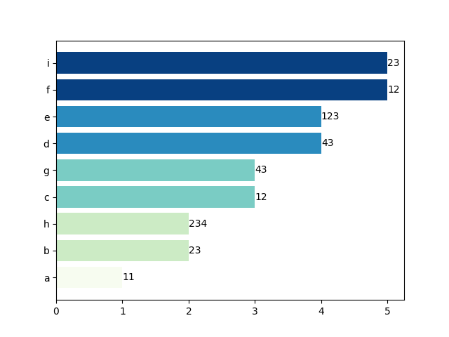
putting bar labels outside the bar
_ = bar_chart(
    [1,2,3,4,4,5,3,2,5],
    ['a','b','c','d','e','f','g','h','i'],
    bar_labels=[11, 23, 12,43, 123, 12, 43, 234, 23],
    bar_label_kws={'label_type':'edge'},
    cmap="GnBu",
    sort=True)
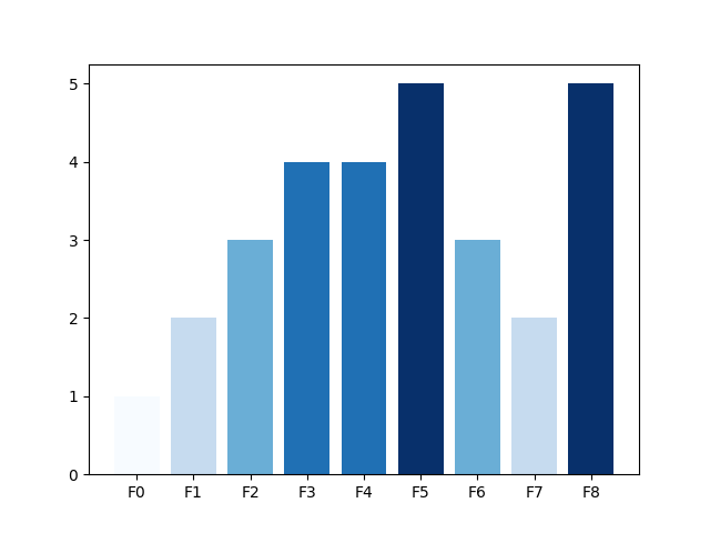
vertical orientation
_ = bar_chart([1,2,3,4,4,5,3,2,5], orient='v')
define color for each bar individually
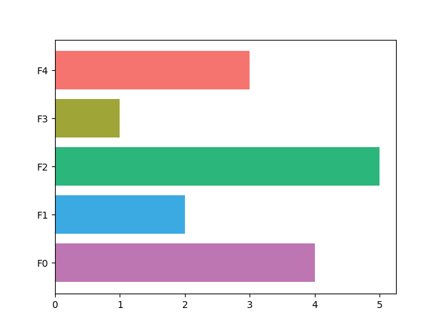
_ = bar_chart([4,2,5,1,3], color=['#BD76B2', '#3BAAE2', '#2BB67B', '#9FA537', '#F5746F'])
error bars
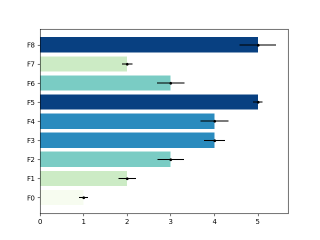
the function bar_chart returns matplotlib axes which can be used for further processing
sv_bar = np.arange(20, 100, 10)
names = [f"Feature {n}" for n in sv_bar]

ax = bar_chart(sv_bar, names,
          bar_labels=sv_bar, bar_label_kws={'label_type':'edge'},
          show=False, sort=True, cmap='summer_r')

print(f"Type of ax is {type(ax)}")

despine_axes(ax, keep=['bottom', 'left'])
ax.set_xlabel(xlabel='mean(|SHAP value|)', fontsize=14, weight='bold')
ax.set_xticklabels(ax.get_xticks().astype(int), size=12, weight='bold')
ax.set_yticklabels(ax.get_yticklabels(), size=12, weight='bold')
plt.tight_layout()
plt.show()
Type of ax is <class 'matplotlib.axes._axes.Axes'>
/home/docs/checkouts/readthedocs.org/user_builds/easy-mpl/checkouts/latest/examples/bar_chart.py:94: UserWarning: set_ticklabels() should only be used with a fixed number of ticks, i.e. after set_ticks() or using a FixedLocator.
  ax.set_xticklabels(ax.get_xticks().astype(int), size=12, weight='bold')
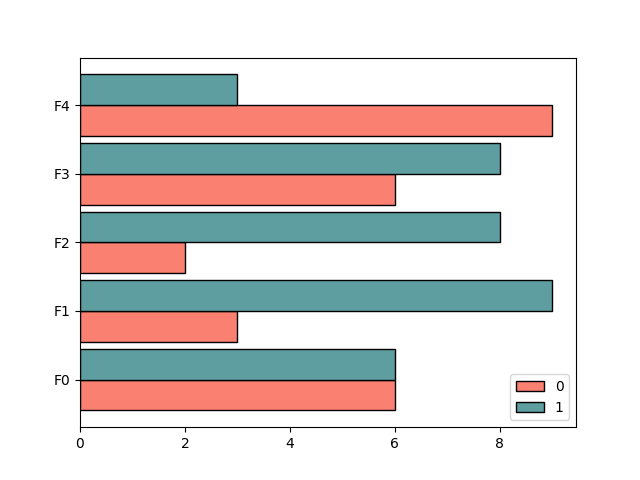
multipler bar charts
data = np.random.randint(1, 10, (5, 2))
_ = bar_chart(data, color=['salmon', 'cadetblue'])
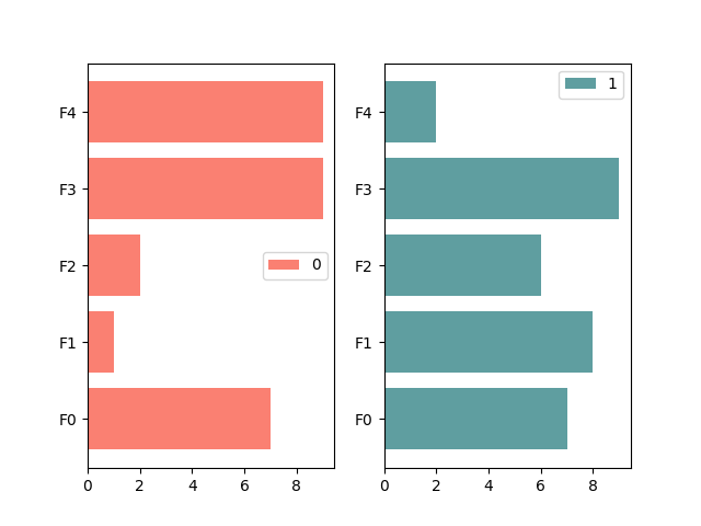
multipler bar charts on separate axes
data = np.random.randint(0, 10, (5, 2))
_ = bar_chart(data, color=['salmon', 'cadetblue'], share_axes=False)
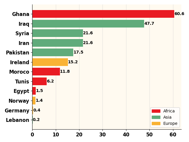
specifying colors for group of bars
colors = {'Asia': '#60AB7B',
          'Europe': '#F9B234',
          'Africa': '#E91B23'}

continents = {'Pakistan': 'Asia', 'Iran': 'Asia', 'Syria': 'Asia',
         'Iraq': 'Asia', 'Lebanon': 'Asia', 'Ireland': 'Europe',
         'Germany': 'Europe', 'Norway': 'Europe', 'Ghana': 'Africa',
         'Egypt': 'Africa', 'Moroco': 'Africa', 'Tunis': 'Africa'}

data = [ 17.5,  21.6,  21.6,  47.7,
         0.2,  15.2,   0.4 ,   1.4,
         60.6,   1.5,  11.8,   6.2]

ax = bar_chart(data, list(continents.keys()),
          bar_labels=data, bar_label_kws={'label_type':'edge',
                                            'fontsize': 10,
                                            'weight': 'bold'},
          show=False, sort=True, color=[colors[val] for val in continents.values()],
          ax_kws=dict(top_spine=False, right_spine=False))

ax.set_xticklabels(ax.get_xticks().astype(int), size=12, weight='bold')
ax.set_yticklabels(ax.get_yticklabels(), size=12, weight='bold')
labels = np.unique(list(continents.values()))
handles = [plt.Rectangle((0,0),1,1, color=colors[l]) for l in labels]
ax.xaxis.grid(True, linestyle='-', which='major', color='lightgrey',
               alpha=0.7)
ax.set(axisbelow=True)  # Hide the grid behind plot objects
ax.set_facecolor('floralwhite')
plt.legend(handles, labels, loc='lower right')
plt.tight_layout()
plt.show()
/home/docs/checkouts/readthedocs.org/user_builds/easy-mpl/checkouts/latest/examples/bar_chart.py:132: UserWarning: set_ticklabels() should only be used with a fixed number of ticks, i.e. after set_ticks() or using a FixedLocator.
  ax.set_xticklabels(ax.get_xticks().astype(int), size=12, weight='bold')
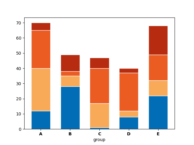
Stacked bar chart
# Values of each group
bars1 = [12, 28, 1, 8, 22]
bars2 = [28, 7, 16, 4, 10]
bars3 = [25, 3, 23, 25, 17]
bars4 = [5, 11, 7, 3, 19]

# Heights of bars1 + bars2
bars = np.add(bars1, np.add(bars2, bars3).tolist()).tolist()

# Names of group and bar width
names = ['A', 'B', 'C', 'D', 'E']
barWidth = 0.65

bar_chart(bars1, color='#006db6', edgecolor='white',
          width=barWidth, orient='v', show=False)

bar_chart(bars2, bottom=bars1, color='#f8aa59',
          edgecolor='white', width=barWidth, orient='v',
          show=False)

bar_chart(bars3, bottom=np.add(bars1, bars2).tolist(), color='#eb5c23',
          edgecolor='white', width=barWidth, orient='v',
          show=False)

bar_chart(bars4, bottom=bars, color='#b72c10',
          edgecolor='white', width=barWidth, orient='v',
          show=False)

# Custom X axis
plt.xticks([0, 1, 2, 3, 4], names, fontweight='bold')
plt.xlabel("group")
plt.show()
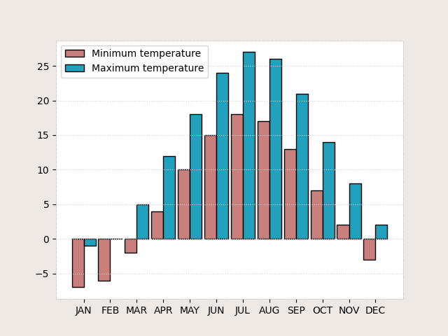
negative values in the data
names = ['JAN','FEB','MAR','APR','MAY','JUN',
         'JUL','AUG','SEP','OCT','NOV','DEC']

temp_max = [-1,0,5,12,18,24,27,26,21,14,8,2]
temp_min = [-7,-6,-2,4,10,15,18,17,13,7,2,-3]


def listOfTuples(l1, l2):
    return list(map(lambda x, y:(x,y), l1, l2))

temp = listOfTuples(temp_min, temp_max)

f, ax = plt.subplots(facecolor = "#EFE9E6")

bar_chart(temp, color=['#c9807d', '#22a1bd'],
              orient='v', labels=names, ax=ax,
              show=False)

ax.grid(axis='y', ls='dotted', color='lightgrey')

for spine in ax.spines.values():
    spine.set_edgecolor('lightgrey')
    spine.set_linestyle('dashed')

plt.legend(['Minimum temperature', 'Maximum temperature'])
plt.show()
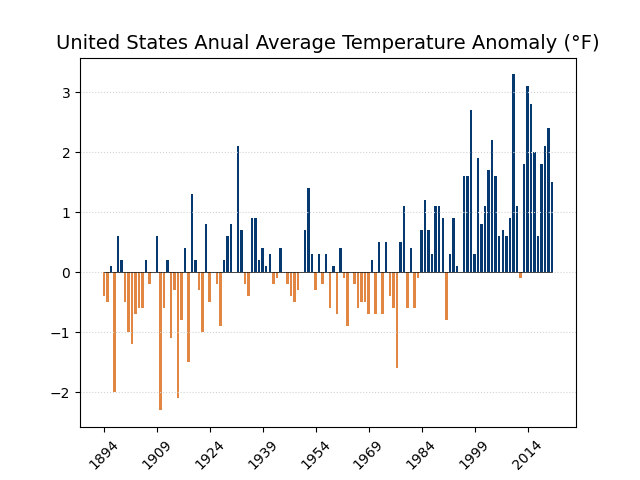
Displaying nagative values with a specific color
data = [-0.4, -0.5, 0.1, -2, 0.6, 0.2, -0.5, -1, -1.2,
-0.7, -0.6, -0.6, 0.2, -0.2, 0, 0.6, -2.3, -0.6, 0.2, -1.1, -0.3, -2.1, -0.8, 0.4,
-1.5, 1.3, 0.2, -0.3, -1, 0.8, -0.5, 0, -0.2, -0.9, 0.2, 0.6, 0.8, 0, 2.1, 0.7, -0.2,
-0.4, 0.9, 0.9, 0.2, 0.4, 0.1, 0.3, -0.2, -0.1, 0.4, 0, -0.2, -0.4, -0.5, -0.3, 0, 0.7,
1.4, 0.3, -0.3, 0.3, -0.2, 0.3, -0.6, 0.1, -0.7, 0.4, -0.1, -0.9, 0, -0.2, -0.6, -0.5,
-0.5, -0.7, 0.2, -0.7, 0.5, -0.7, 0.5, -0.4, -0.6, -1.6, 0.5, 1.1, -0.6, 0.4, -0.6, -0.1,
0.7, 1.2, 0.7, 0.3, 1.1, 1.1, 0.9, -0.8, 0.3, 0.9, 0.1, 0, 1.6, 1.6, 2.7, 0.3, 1.9, 0.8,
1.1, 1.7, 2.2, 1.6, 0.6, 0.7, 0.6, 0.9,3.3, 1.1, -0.1, 1.8, 3.1, 2.8, 2, 0.6, 1.8,
2.1, 2.4, 1.5]

colors = ['#063970' if e >= 0 else '#e28743' for e in data]

ax = bar_chart(data, orient='v', color=colors,
          width=0.7, rotation=45,
          labels='', show=False)
plot(np.zeros(128), ax=ax, show=False, color='black', lw=0.5)

ax.grid(axis='y', ls='dotted', color='lightgrey')

times = np.arange(np.datetime64('1894'),
                  np.datetime64('2022'), np.timedelta64(1, 'Y'))

ax.set_xticklabels(times)
ax.xaxis.set_major_locator(plt.MaxNLocator(10))
ax.set_title('United States Anual Average Temperature Anomaly (°F)',
             fontdict={'fontsize': 14})
plt.show()
Total running time of the script: (0 minutes 2.560 seconds)