Note
Go to the end to download the full example code. or to run this example in your browser via Binder
r. Adding Marginal plots
This lesson shows how to add marginal plots to an existing matplotlib axes
# sphinx_gallery_thumbnail_number = 2

import numpy as np
from easy_mpl import plot
from easy_mpl import regplot
import matplotlib.pyplot as plt
from easy_mpl.utils import version_info
from easy_mpl.utils import AddMarginalPlots

version_info()
{'easy_mpl': '0.21.5', 'matplotlib': '3.9.4', 'numpy': '2.0.2', 'pandas': '2.2.3', 'scipy': '1.13.1'}
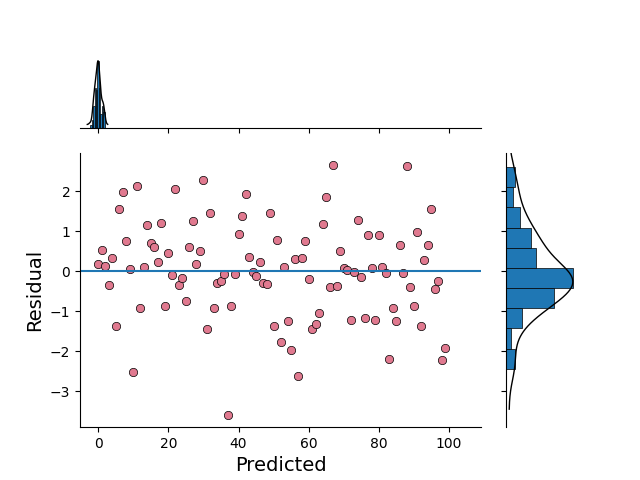
We can add marginal plots to our main plot using AddMarginalPlots class.
The marginal plots are used to show the distribution of x-axis data and y-axis data.
The distribution of x-axis data is shown on top of main plot and the distribution
of y-axis data is shown on right side of main plot.
x = np.random.normal(size=100)
y = np.random.normal(size=100)
e = x-y

ax = plot(
    e,
    'o',
    show=False,
    markerfacecolor=np.array([225, 121, 144])/256.0,
    markeredgecolor="black", markeredgewidth=0.5,
    ax_kws=dict(
        xlabel="Predicted",
        ylabel="Residual",
        xlabel_kws={"fontsize": 14},
        ylabel_kws={"fontsize": 14}),
     )

# draw horizontal line on y=0
ax.axhline(0.0)
AddMarginalPlots(ax)(x, y)
plt.show()
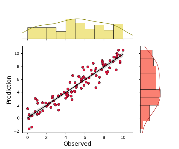
rng = np.random.default_rng(313)

x = rng.uniform(0, 10, size=100)
y = x + rng.normal(size=100)


# We can show distribution of x and y along the marginals
# This can be done by setting the ``marginals`` keyword to True

RIDGE_LINE_KWS = [{'color': 'olive', 'lw': 1.0}, {'color': 'firebrick', 'lw': 1.0}]
HIST_KWS = [{'color': 'khaki'}, {'color': 'salmon'}]

_ = regplot(x, y,
             marker_size = 35,
             marker_color='crimson',
             line_color='k',
             fill_color='k',
             scatter_kws={'edgecolors':'black', 'linewidth':0.5,
                          },
             marginals=True,
             marginal_ax_pad=0.25,
             marginal_ax_size=0.7,
             ridge_line_kws=RIDGE_LINE_KWS,
             hist=True,
             hist_kws=HIST_KWS)
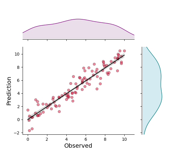
Instead of drawing histograms, we can decide to fill the ridges drawn by kde lines on marginals.
fill_kws = [{'color': 'thistle'}, {'color': 'lightblue'}]
RIDGE_LINE_KWS1 = [{'color': 'purple', 'lw': 1.0}, {'color': 'teal', 'lw': 1.0}]

_ = regplot(x, y,
            marker_size = 40,
            marker_color='crimson',
            line_color='k',
            fill_color='k',
            scatter_kws={'edgecolors':'black', 'linewidth':0.5,
                          'alpha': 0.5},
            marginals=True,
            marginal_ax_pad=0.25,
            marginal_ax_size=0.7,
            ridge_line_kws=RIDGE_LINE_KWS1,
            hist=False,
            fill_kws=fill_kws)
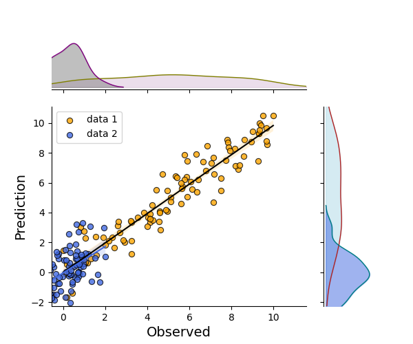
multiple regression lines with customized marker, line and fill style
cov = np.array(
    [[1.0, 0.9, 0.7],
     [0.9, 1.2, 0.8],
     [0.7, 0.8, 1.4]]
)
data = rng.multivariate_normal(np.zeros(3),
                               cov, size=100)

ax = regplot(x, y, line_color='k',
             marker_color='orange', marker_size=35, fill_color='orange',
             scatter_kws={'edgecolors':'black', 'linewidth':0.8, 'alpha': 0.8},
             show=False, label="data 1")

axHistx, axHisty = AddMarginalPlots(
    ax, hist=False, fill_kws=fill_kws,
    ridge_line_kws=RIDGE_LINE_KWS
)(x, y)

fill_kws1 = [{'color': 'grey'}, {'color': 'royalblue'}]
_ = regplot(data[:, 0], data[:, 2], line_color='royalblue', ax=ax,
                marker_color='royalblue', marker_size=35, fill_color='royalblue',
             scatter_kws={'edgecolors':'black', 'linewidth':0.8, 'alpha': 0.8},
             show=False, label="data 2", ax_kws=dict(legend_kws=dict(loc=(0.1, 0.8))))

AddMarginalPlots(
    ax, hist=False,
    fill_kws=fill_kws1, ridge_line_kws=RIDGE_LINE_KWS1)(data[:, 0], data[:, 2], axHistx, axHisty)

plt.show()
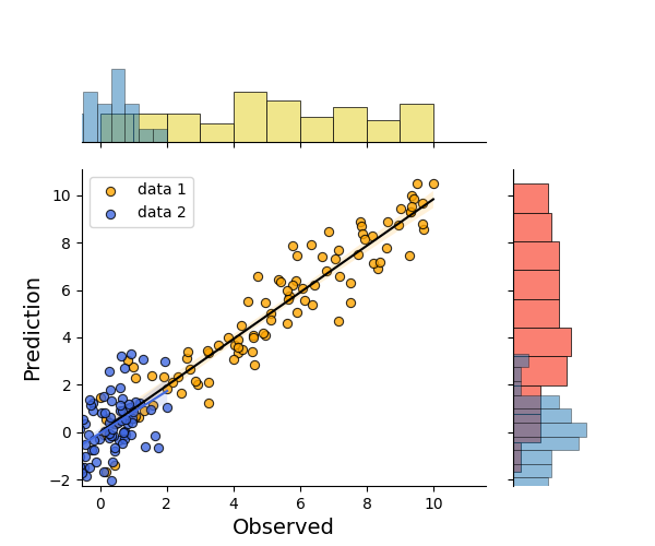
Showing distributions using histograms
ax = regplot(x, y, line_color='k',
             marker_color='orange', marker_size=35, fill_color='orange',
             scatter_kws={'edgecolors':'black', 'linewidth':0.8, 'alpha': 0.8},
             show=False, label="data 1")

axHistx, axHisty = AddMarginalPlots(
    ax, ridge=False, hist_kws=HIST_KWS
)(x, y)

fill_kws1 = [{'color': 'grey'}, {'color': 'royalblue'}]
_ = regplot(data[:, 0], data[:, 2], line_color='royalblue', ax=ax,
                marker_color='royalblue', marker_size=35, fill_color='royalblue',
             scatter_kws={'edgecolors':'black', 'linewidth':0.8, 'alpha': 0.8},
             show=False, label="data 2", ax_kws=dict(legend_kws=dict(loc=(0.1, 0.8))))

HIST_KWS1 = {'alpha': 0.5}
AddMarginalPlots(
    ax, ridge=False, hist_kws=HIST_KWS1
)(data[:, 0], data[:, 2], axHistx, axHisty)

plt.show()
Total running time of the script: (0 minutes 1.814 seconds)