Note
Go to the end to download the full example code. or to run this example in your browser via Binder
e. hist
This file shows the usage of hist() function.
from easy_mpl import hist
import pandas as pd
import numpy as np
import matplotlib.pyplot as plt
from matplotlib import colors
from easy_mpl.utils import version_info


version_info()  # print version information of all the packages being used
{'easy_mpl': '0.21.5', 'matplotlib': '3.9.4', 'numpy': '2.0.2', 'pandas': '2.2.3', 'scipy': '1.13.1'}
f = "https://raw.githubusercontent.com/AtrCheema/AI4Water/master/ai4water/datasets/arg_busan.csv"
df = pd.read_csv(f, index_col='index')
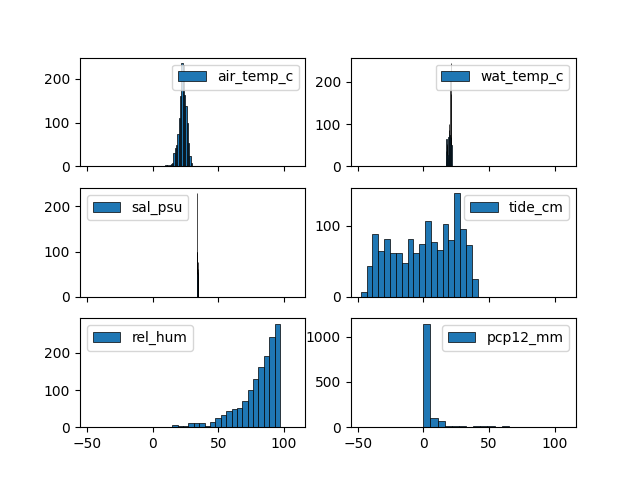
cols = ['air_temp_c', 'wat_temp_c', 'sal_psu', 'tide_cm', 'rel_hum', 'pcp12_mm']
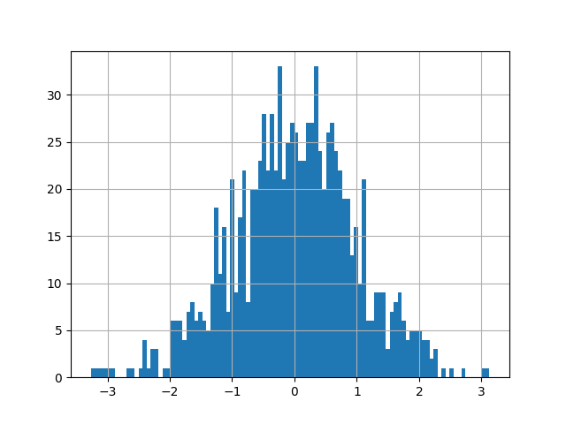
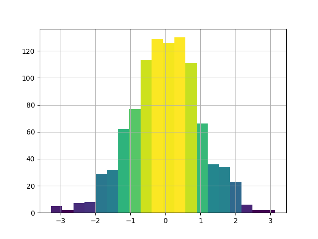
data = np.random.randn(1000)
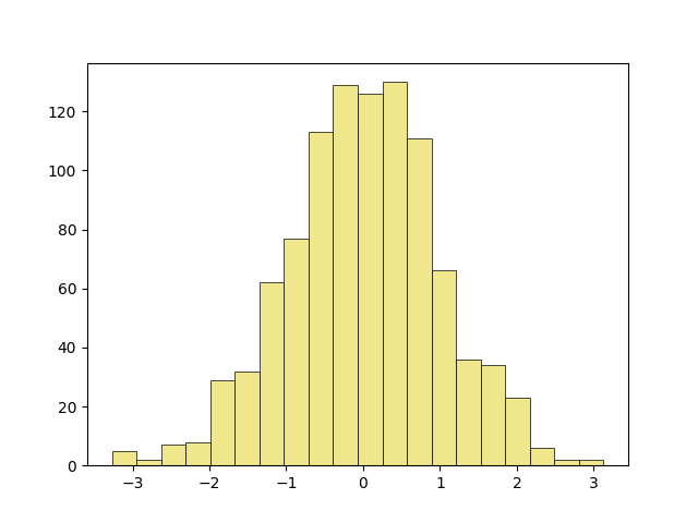
let’s start with a basic histogram
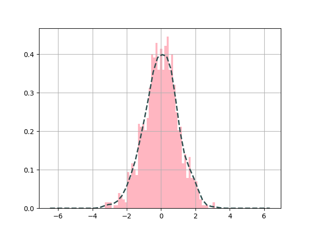
adding KDE and specifying line properties
setting grid to False
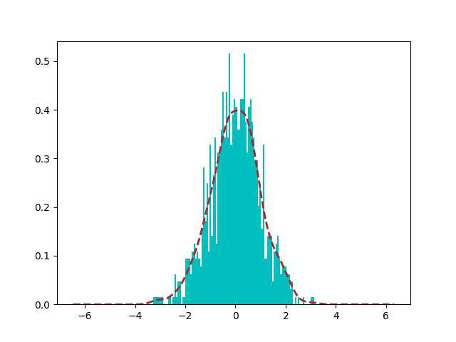
manipulating kde calculation
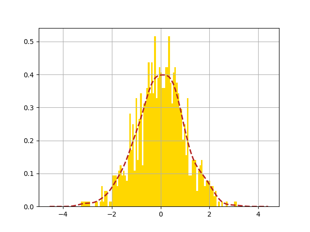
Any argument for matplotlib.hist can be given to hist function for example
color or edgecolor
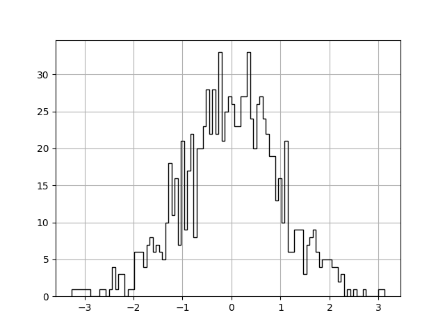
histtype defines the type of histogram to show. Here we are
using step which generates a lineplot that is by default unfilled.
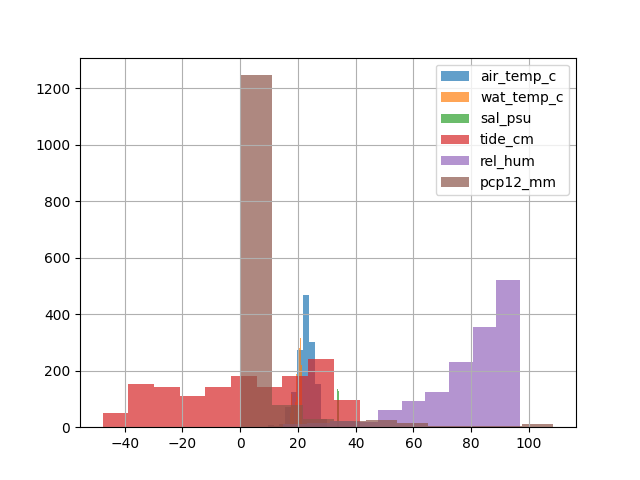
if data contains multiple columns, it will be plotted on same axis
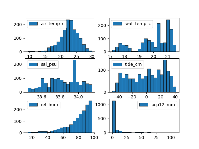
share_axes can be set to False to plot multiple columns on different
axis.
Arguments of subplots can be given to subplots_kws
return_axes can be set to True if we want to further work on
current axis
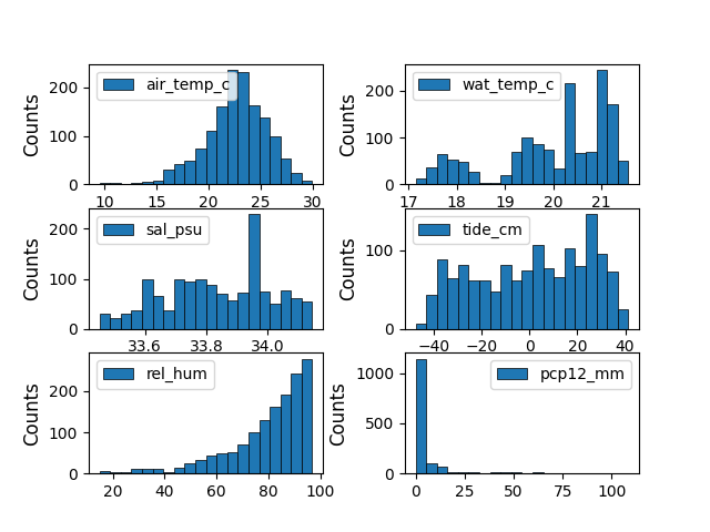
6 6
we can further modify colors for better understanding and correct readings for example in this plot, the color represent the frequency of data.
Total running time of the script: (0 minutes 3.354 seconds)