Note
Go to the end to download the full example code. or to run this example in your browser via Binder
p. boxplot
This file shows the usage of boxplot() function.
# sphinx_gallery_thumbnail_number = -3

import pandas as pd
import matplotlib.pyplot as plt

from easy_mpl import boxplot, plot
from easy_mpl.utils import _rescale
from easy_mpl.utils import version_info

version_info()  # print version information of all the packages being used
{'easy_mpl': '0.21.5', 'matplotlib': '3.9.4', 'numpy': '2.0.2', 'pandas': '2.2.3', 'scipy': '1.13.1'}
f = "https://raw.githubusercontent.com/AtrCheema/AI4Water/master/ai4water/datasets/arg_busan.csv"
dataframe = pd.read_csv(f, index_col='index')
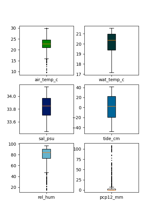
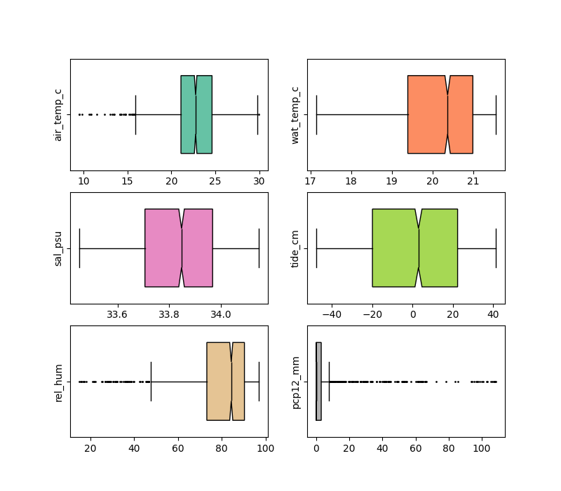
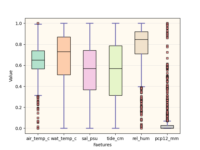
cols = ['air_temp_c', 'wat_temp_c', 'sal_psu', 'tide_cm', 'rel_hum', 'pcp12_mm']
df = dataframe.copy()
for col in df.columns:
df[col] = _rescale(df[col].values)
print(f"Our data has {len(df)} rows and {df.shape[1]} columns")
Our data has 1446 rows and 25 columns
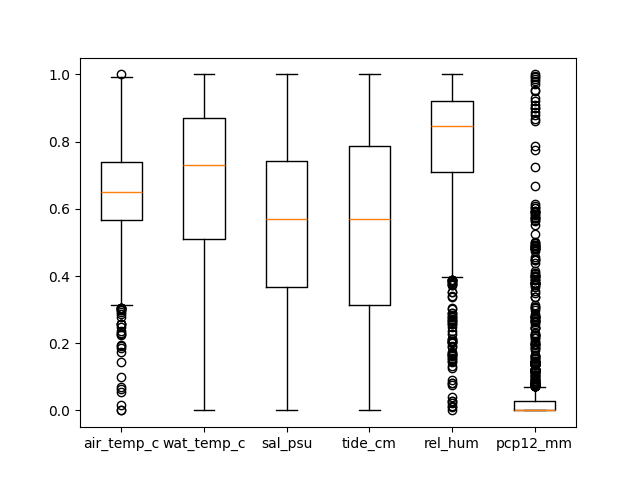
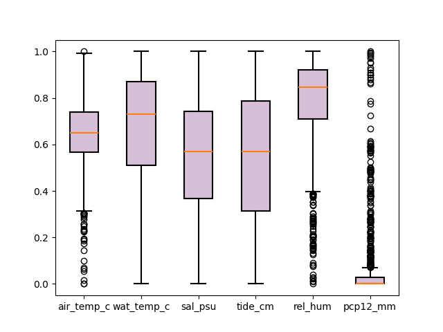
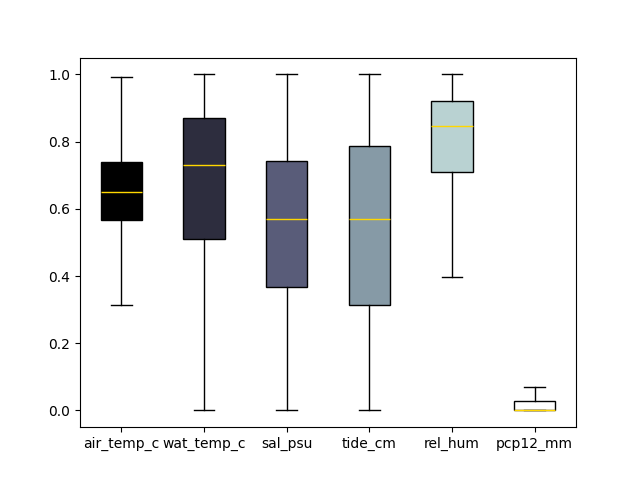
To draw a boxplot we can provide a pandas DataFrame
We can also provide multiple (numpy) array
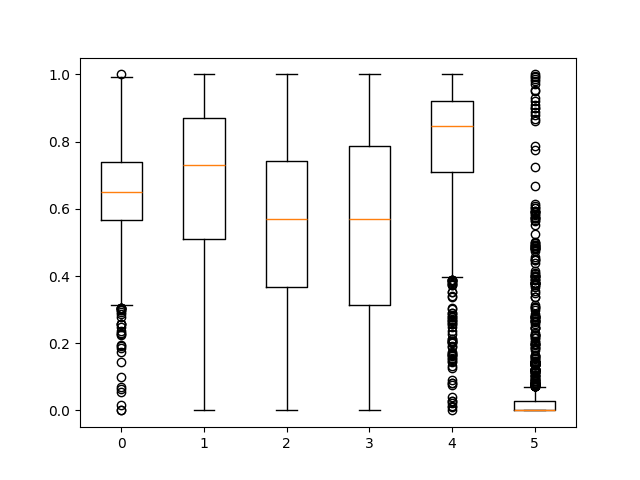
We can give the list of arrays
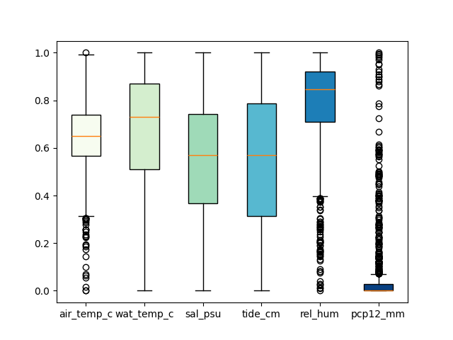
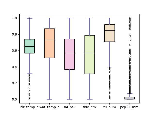
The fill color can be specificed using any valid matplotlib cmap
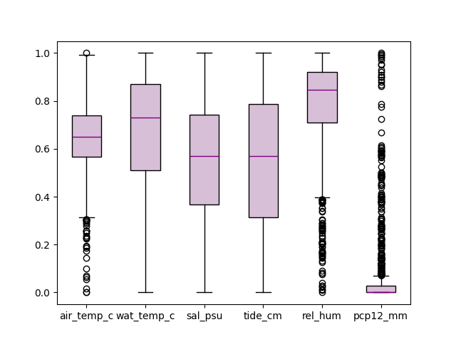
change color of median line
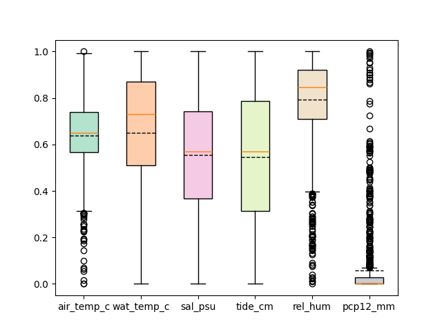
different color for box boundary and filling the box
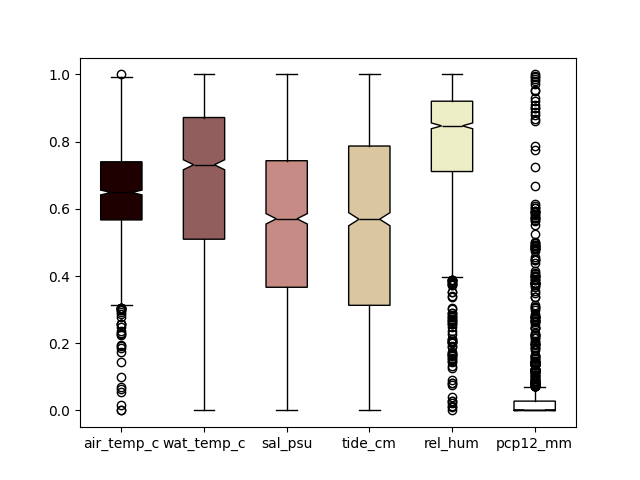
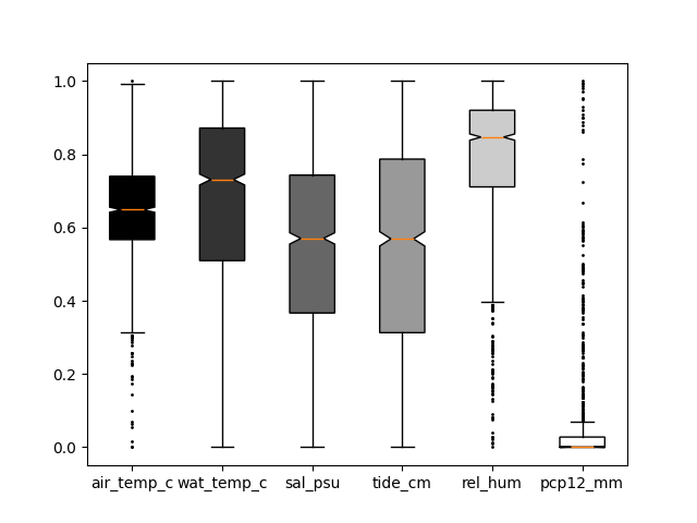
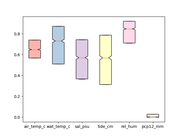
show notches
don’t show outliers
change circle size of fliers
edit caps and whiskers properties
don’t show whiskers
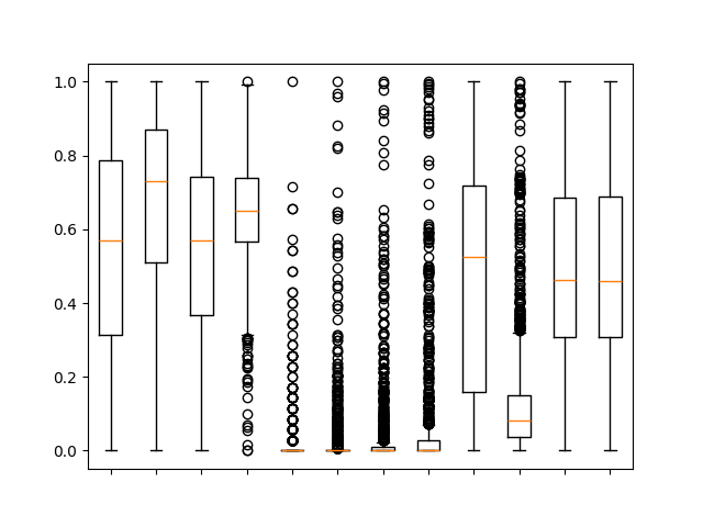
If we want to draw a separate boxplot on each axes, we can set the value
of share_axes to False.
To draw the horizontal boxplots, we can set vert to False.
The boxplot function returns a tuple. The first argument is the matplotlib axes and
second value is a dictionary consisting of output from axes.boxplot.
ax, _ = boxplot(df[cols], fill_color="Pastel2", patch_artist=True,
            flierprops={"ms": 4.0,
                        "marker": 's',
                        "markerfacecolor": 'lightcoral',
                        "alpha":0.8
                        },
            medianprops={"color": "black"},
            capprops={'color':'#7570b3', "linewidth":2},
            whiskerprops={'color':'#7570b3', "linewidth":2},
             show=False)

ax.yaxis.grid(True, linestyle='-', which='major', color='lightgrey',
               alpha=0.5)
ax.set(
    axisbelow=True,  # Hide the grid behind plot objects
    xlabel='Faetures',
    ylabel='Value',
)
ax.set_facecolor('floralwhite')
plt.show()
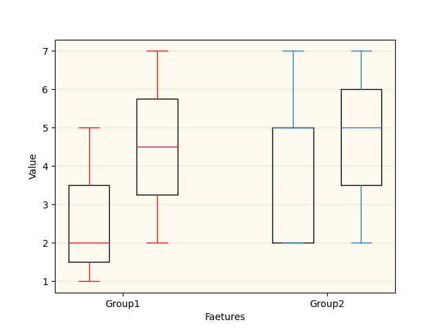
In order to make grouped boxplots, we can drawo two boxplots on same axes.
We can specify the position of boxes on the axes using positions argument.
# Some fake data to plot
A= [[1, 2, 5,],  [7, 2]]
B = [[5, 7, 2, 2, 5], [7, 2, 5]]

ax, _ = boxplot(A, line_color='#D7191C', positions=[1, 2], sym='', widths = 0.6,
             show=False)

_, _ = boxplot(B, line_color="#2C7BB6", positions=[4, 5], sym='', widths = 0.6,
             show=False)

ax.yaxis.grid(True, linestyle='-', which='major', color='lightgrey',
               alpha=0.5)
ax.set_xticks([1.5, 4.5])
ax.set_xticklabels(['Group1', 'Group2'])
ax.set(
    axisbelow=True,  # Hide the grid behind plot objects
    xlabel='Faetures',
    ylabel='Value',
)

ax.set_facecolor('floralwhite')

plt.show()
/home/docs/checkouts/readthedocs.org/user_builds/easy-mpl/checkouts/latest/easy_mpl/_box.py:184: UserWarning:
xticks (4) and xticklabels (2) dont match
  warnings.warn(f"""
join mean of each box through a line
plt.close('all')
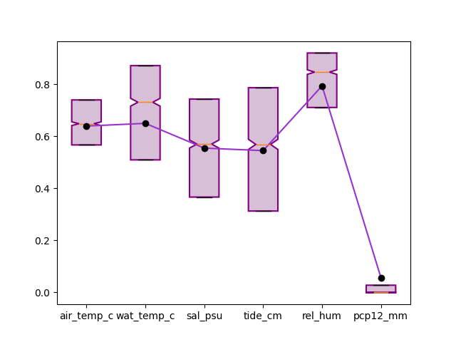
ax, _ = boxplot(df[cols], fill_color="thistle",
patch_artist=True, notch=True,
boxprops = {"linewidth":1.5,
"color":'purple'},
showmeans=True, meanprops={"markerfacecolor": "black",
"markeredgecolor":'black',
"marker":"o"},
showfliers=False, whis=0.0,
show=False)
plot(ax.get_xticks(), df[cols].mean().values,
color="darkorchid", ax=ax)
<Axes: >
Total running time of the script: (0 minutes 2.821 seconds)