Note
Go to the end to download the full example code. or to run this example in your browser via Binder
a. plot
This file shows the usage of plot() function.
# todo, what happens when we pass three or more arrays!

# sphinx_gallery_thumbnail_number = 5

import numpy as np
import pandas as pd
from easy_mpl import plot
import matplotlib.pyplot as plt
import matplotlib.dates as mdates
from easy_mpl.utils import version_info, despine_axes

version_info()  # print version information of all the packages being used
{'easy_mpl': '0.21.5', 'matplotlib': '3.9.4', 'numpy': '2.0.2', 'pandas': '2.2.3', 'scipy': '1.13.1'}
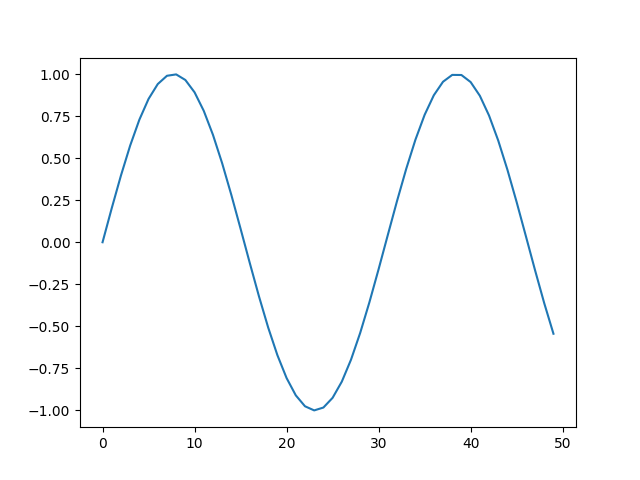
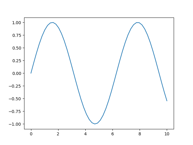
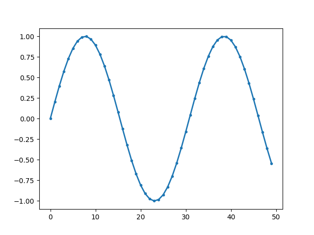
A basic plot can be drawn just by providing a sequence of numbers to the plot
function.
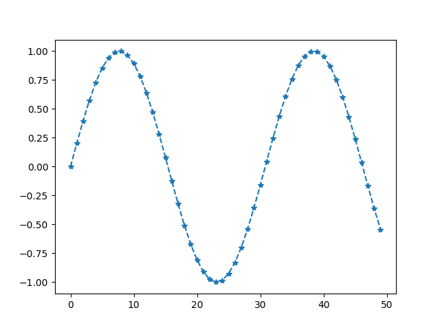
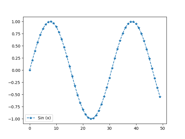
We can however set the style of the plot/marker using the second argument.
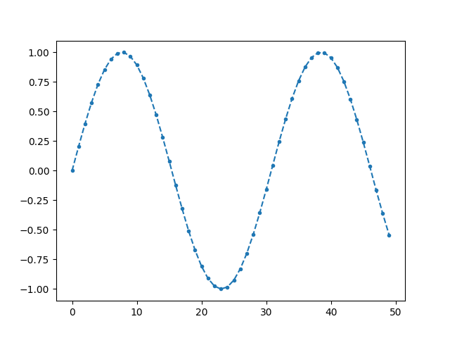
The complete list of available marker styles can be seen here <https://matplotlib.org/stable/api/markers_api.html>_
The color can be specified by making use of c or color
argument to plot function.
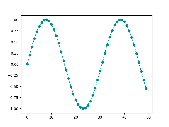
You can refer to this page to see names of all valid matplotlib color names.
We can explicitly provide rgb values of a color.
We can set the show=False in order to further work the current active axes
If we provide two arrays to plot, the first array is used for the horizontal axis
and second argument/array is used as corresponding y values.
In this case, the second argument is not used to define marker style.
However, when we give just one array, the second argument is interpreted as marker style.
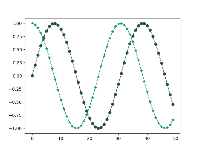
When we provide two arrays, the third argument is interpreted as marker style.
The legend can be set by making use of label argument.
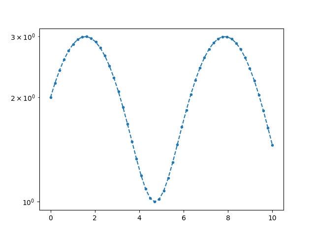
If we want the y-axis to be on log scale, we can set logy to True
and pass it as ax_kws dictionary.
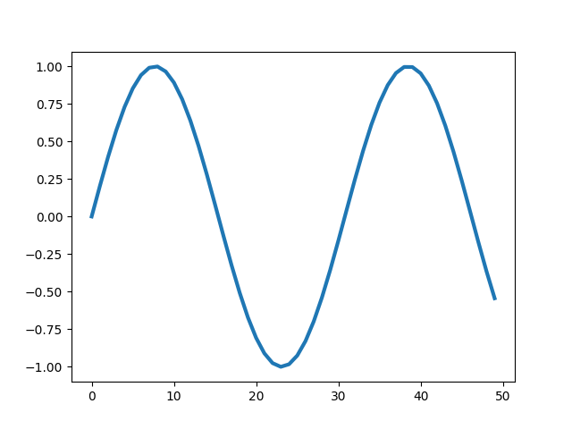
The width of the line can be set using lw or linewidth argument.
Instead of numpy array, we can also provide pandas Series
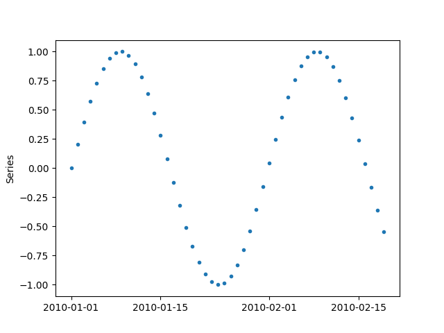
or a pandas DataFrame with 1 column
x = pd.DataFrame(y, columns=["sin"],
                 index=pd.date_range("20100101", periods=len(y), freq="D"))
_ = plot(x, '.')
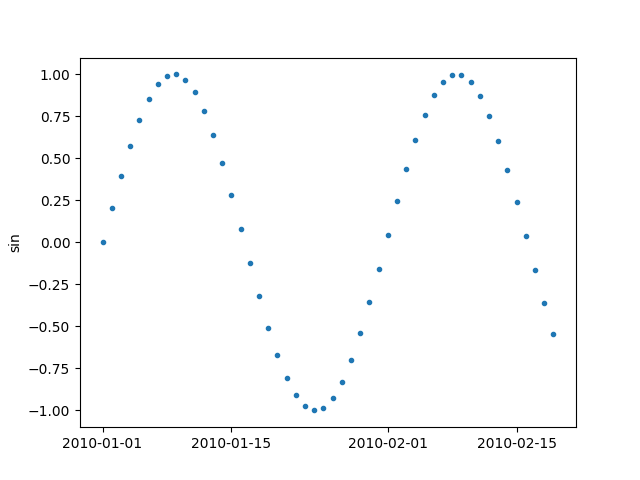
It should be noted that the index of pandas Series or DataFrame, which is a DateTimeIndex in this case, is used for x-axis
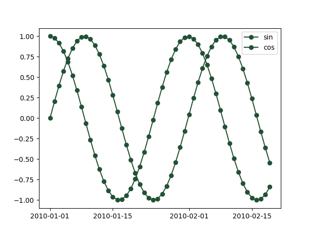
If we provide pandas DataFrame with two columns, both columns are plotted.
x = pd.DataFrame(np.column_stack([y, y2]),
                 columns=["sin", "cos"],
                 index=pd.date_range("20100101", periods=len(y), freq="D"))
_ = plot(x, '-o', color=np.array([35, 81, 53]) / 256.0)
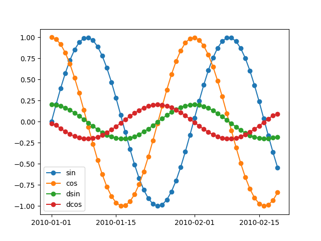
For more than one columns, if we don’t fix the color, the colors are chosen randomly.
dy = np.gradient(y)
dy2 = np.gradient(y2)
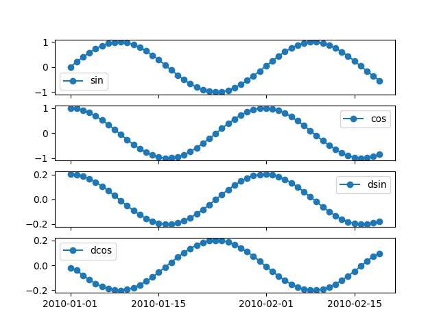
x = pd.DataFrame(np.column_stack([y, y2, dy, dy2]),
columns=["sin", "cos", "dsin", "dcos"],
index=pd.date_range("20100101", periods=len(y), freq="D"))
_ = plot(x, '-o')
If the dataframe more than one columne, we can plot each column on separate axes
The marker size can be set using markersize or ms argument.
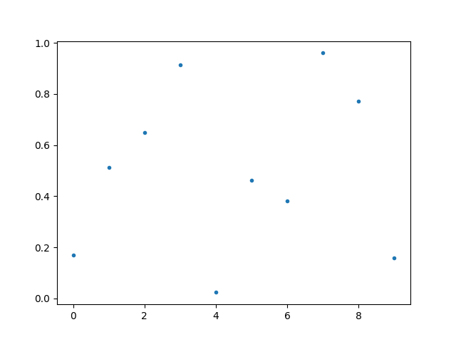
If the array contains nans, they are simply notplotted
The plot function returns matplotlib Axes object, which can be used for further
processing.
x = np.random.normal(size=100)
y = np.random.normal(size=100)
e = x-y
ax = plot(
    e,
    'o',
    show=False,
    markerfacecolor=np.array([225, 121, 144])/256.0,
    markeredgecolor="black", markeredgewidth=0.5,
    ax_kws=dict(
    xlabel="Predicted",
    ylabel="Residual",
    xlabel_kws={"fontsize": 14},
    ylabel_kws={"fontsize": 14}),
     )

print(f"Type of ax is: {type(ax)}")

# draw horizontal line on y=0
ax.axhline(0.0)
plt.show()
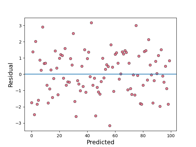
Type of ax is: <class 'matplotlib.axes._axes.Axes'>
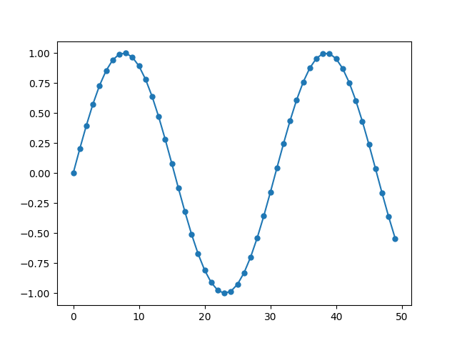
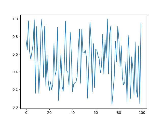
We can also provide an already existing axes to plot function using ax argument.
_, ax = plt.subplots()
_ = plot(np.random.random(100), ax=ax)
The arguments for design/manipulation of x/y axis labels and tick labels are handled
by process_axis function. All the arugments of process_axis function can be given
to the plot function.
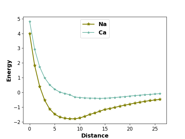
y1 = [3.983,1.82,0.397,-0.54,-1.14,-1.48,-1.68,
      -1.76,-1.80,-1.80,-1.74,-1.63,-1.50,-1.40,
      -1.28,-1.16,-1.10,-1.02,-0.94,-0.87,-0.80,
      -0.73,-0.67,-0.61,-0.56,-0.52,-0.48]

y2 = [4.81, 2.92, 1.73, 0.98, 0.51, 0.21, 0.02,
      -0.08, -0.16, -0.32, -0.35, -0.38, -0.39,
      -0.40, -0.41, -0.40, -0.38, -0.35, -0.32,
      -0.29, -0.25, -0.22, -0.19, -0.16, -0.14,
      -0.11, -0.09]


plot(y1, '-*', lw=2.0, ms=8, label="Na", color="olive",  show=False)

_ = plot(y2, '-*', label="Ca", color="#69b3a2",
     ax_kws=dict(
     legend_kws = {"loc": "upper center", 'prop':{"weight": "bold", 'size': 14}},
     xlabel="Distance", xlabel_kws={"fontsize": 14, 'weight': "bold"},
     ylabel="Energy", ylabel_kws={"fontsize": 14, 'weight': 'bold'},
     xtick_kws = {'labelsize': 12},
     ytick_kws = {'labelsize': 12}),
     )
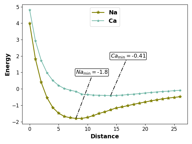
We can add text to a plot using the axes object returned by the plot function.
plot(y1, '-*', lw=2.0, ms=8, label="Na", color="olive", show=False)

ax = plot(y2, '-*', label="Ca", show=False, color="#69b3a2",
          ax_kws=dict(
     legend_kws = {"loc": "upper center", 'prop':{"weight": "bold", 'size': 14}},
     xlabel="Distance", xlabel_kws={"fontsize": 14, 'weight': "bold"},
     ylabel="Energy", ylabel_kws={"fontsize": 14, 'weight': 'bold'},
     xtick_kws = {'labelsize': 12},
     ytick_kws = {'labelsize': 12}),
     )

# Add line conecting mean value and its label
ax.plot([np.argmin(y1), 11], [np.min(y1), 1], ls="dashdot", color="black", zorder=3)

# Add mean value label.
ax.text(np.argmin(y1), 1,
    r"$Na_{\rm{min}} = $" + str(round(np.min(y1), 2)),
    fontsize=13, va="center",
    bbox=dict(facecolor="white", edgecolor="black", boxstyle="round", pad=0.15),
    zorder=10  # to make sure the line is on top
)

# Add line conecting mean value and its label
ax.plot([np.argmin(y2), 17], [np.min(y2), 2], ls="dashdot", color="black", zorder=3)

# Add mean value label.
ax.text(np.argmin(y2), 2,
    r"$Ca_{\rm{min}} = $" + str(round(np.min(y2), 2)),
    fontsize=13, va="center",
    bbox=dict(facecolor="white", edgecolor="black", boxstyle="round", pad=0.15),
    zorder=10  # to make sure the line is on top
)

plt.tight_layout()
plt.show()
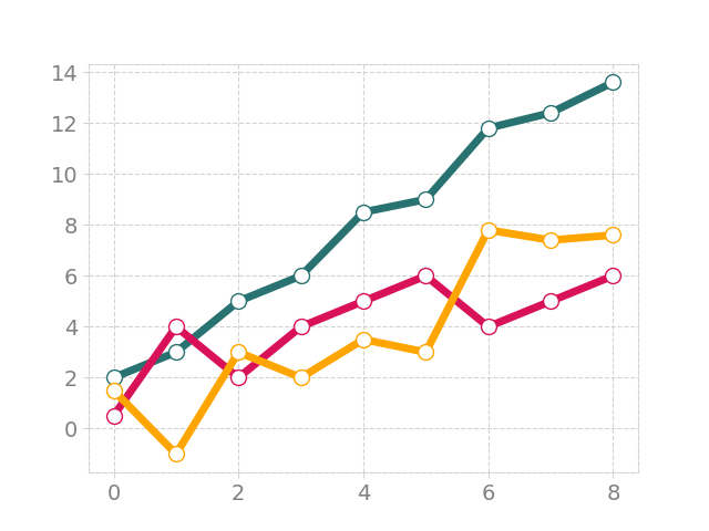
setting spine colors
y1 = [2, 3,5,6, 8.5, 9, 11.8, 12.4, 13.6]
y2 = [0.5, 4, 2, 4, 5, 6, 4, 5, 6]
y3 = np.array(y1) - np.array(y2)

plot(y1, marker='o', mfc='white', ms=10, lw=5,
     color='#287271', show=False)
plot(y2, marker='o', mfc='white', ms=10, lw=5,
     color='#D81159', show=False)
ax = plot(y3, marker='o', mfc='white', ms=10, lw=5,
     color='orange', show=False)
ax.grid(ls='--', color='lightgrey')
for spine in ax.spines.values():
    spine.set_edgecolor('lightgrey')
    spine.set_linestyle('dashed')
ax.tick_params(color='lightgrey', labelsize=14, labelcolor='grey')
plt.show()
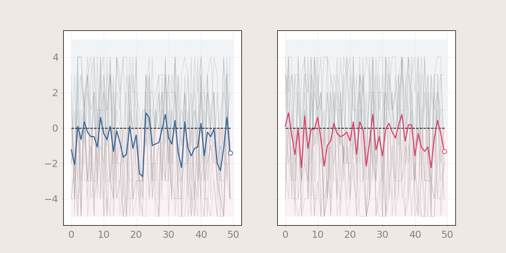
using fill between
n = 12
x1 = np.random.randint(-5, 5, (50, n))
x2 = np.random.randint(-5, 5, (50, n))

f, axes = plt.subplots(1, 2, figsize=(10, 5), sharey="all", facecolor = "#EFE9E6")
axes[0].grid(ls='--', color='#efe9e6', zorder=2)
axes[1].grid(ls='--', color='#efe9e6', zorder=2)
for i in range(n):

    plot(x1[:, i], ax=axes[0], lw = .75, color = 'grey', alpha = 0.25,
         show=False)
    plot(x2[:, i], ax=axes[1], lw=.75, color='grey', alpha=0.25,
         show=False)

plot(np.zeros(50), ax=axes[0], show=False, color='black', ls='dashed', lw=1)
plot(np.zeros(50), ax=axes[1], show=False, color='black', ls='dashed', lw=1)

plot(x1.mean(axis=1), ax=axes[0], show=False,
     lw=1.5, color='#336699', zorder=5, markevery=[-1], marker='o', ms=6, mfc='white')
plot(x2.mean(axis=1), ax=axes[1], show=False,
     lw=1.5, color='#DA4167', zorder=5, markevery=[-1], marker='o', ms=6, mfc='white')

axes[0].fill_between(x=[0, 50], y1=0, y2=5, color='#336699', alpha=0.05,
                ec='None', hatch='......', zorder=1)
axes[0].fill_between(x=[0, 50], y1=0, y2=-5, color='#DA4167',
                     alpha=0.05, ec='None', hatch='......', zorder=1)

axes[0].tick_params(color='lightgrey', labelsize=14, labelcolor='grey')

axes[1].fill_between(x=[0, 50], y1=0, y2=5, color='#336699', alpha=0.05,
                ec='None', hatch='......', zorder=1)
axes[1].fill_between(x=[0, 50], y1=0, y2=-5, color='#DA4167',
                     alpha=0.05, ec='None', hatch='......', zorder=1)
axes[1].tick_params(color='lightgrey', labelsize=14, labelcolor='grey')
plt.show()
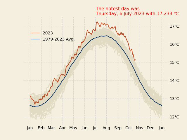
working with axes ticks and ticklabels
data = pd.read_json('https://climatereanalyzer.org/clim/t2_daily/json_cfsr/cfsr_world_t2_day.json')
index = data.pop('name')
data = pd.DataFrame(
    np.array([np.array(data.iloc[row, :].values[0]) for row in range(45)]),
    index=pd.to_datetime(index[0:45])
)
data = data.astype(float)

f, ax = plt.subplots(facecolor="#f5efdf",)
for i in range(len(data)):
    plot(data.iloc[i, :].values, show=False, ax=ax, color='#e1dbc3')

plot(data.iloc[-1, :],
     show=False, ax=ax, color='#c1481c', label='2023')
plot(data.mean(axis=0), ax=ax, color='#0b3363', show=False,
     label="1979-2023 Avg.")

yticklabels = []
for label in ax.get_yticklabels():
    yticklabels.append(f"{label.get_text()} °C")
ax.set_yticklabels(yticklabels)

ax.tick_params(axis=u'both', which=u'both',length=0) # Hide ticks but show tick labels
ax.yaxis.tick_right()
# show month names as tick labels
ax.xaxis.set_major_locator(mdates.MonthLocator())
ax.xaxis.set_major_formatter(mdates.DateFormatter('%b'))
# Remove y label
ax.set_ylabel('')
ax.legend(frameon=False, fancybox=False, bbox_to_anchor=(0.38, 0.9))

# setting grid, facecolor and spines
ax.grid(visible=True, ls='--', color='lightgrey')
ax.set_facecolor('#f5efdf')
despine_axes(ax)

ts = pd.concat([data.iloc[i, :] for i in range(data.shape[0])]).dropna()
ts.index = pd.date_range(data.index[0], periods=len(ts), freq="D")
max_temp = ts.idxmax()
ax.text(0.5, 1.05,
    f"""The hotest day was {max_temp.day_name()},
{max_temp.day} {max_temp.month_name()} {max_temp.year} with {round(data.max().max(), 2)}°C""",
    fontsize=11, va="center",
        color="red", zorder=10,
        transform=ax.transAxes
)
ax.plot(data.iloc[-1, :].idxmax(), data.iloc[-1, :].max(), 'ro',
        markersize=10, fillstyle='none', markeredgewidth=0.8)
ax.plot(data.iloc[-1, :].idxmax(), data.iloc[-1, :].max(), 'ro',
        markersize=15, fillstyle='none', markeredgewidth=0.6)
ax.plot(data.iloc[-1, :].idxmax(), data.iloc[-1, :].max(), 'ro',
        markersize=20, fillstyle='none', markeredgewidth=0.4)
plt.show()
/home/docs/checkouts/readthedocs.org/user_builds/easy-mpl/checkouts/latest/examples/plot.py:327: UserWarning: set_ticklabels() should only be used with a fixed number of ticks, i.e. after set_ticks() or using a FixedLocator.
  ax.set_yticklabels(yticklabels)
Total running time of the script: (0 minutes 5.334 seconds)